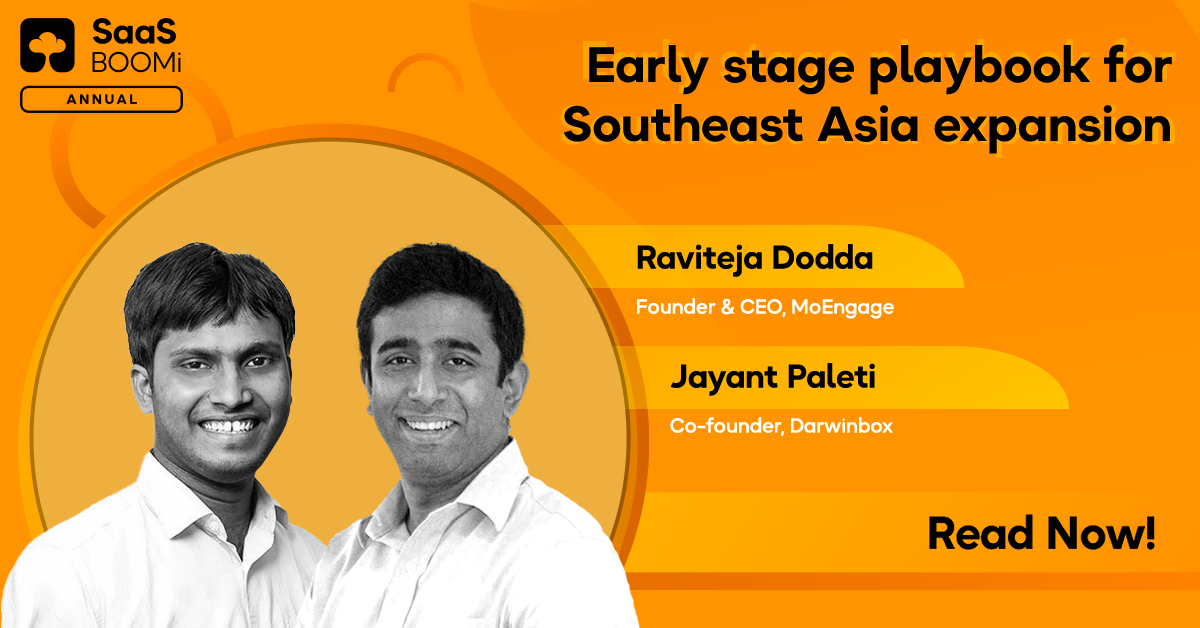
In the summer of 2015, a group of SaaS founders came together to network, share, and learn from each other. Today, the group has grown into a massive community of SaaS founders, leading India’s SaaS ecosystem and being closer than ever to realizing their ambition of evolving India into a SaaS nation. Through our evolution as a SaaS community, we have constantly kept improving and adding new verticals/products in our quest.
We have introduced engaging podcasts and blogs in the learning hub. Insightful events like SaaSBOOMi Growth and SaaSBOOMi Build, each targeted to help founders and SaaS leaders at specific stages of their SaaS journeys, and our monthly meetups under SaaSBOOMi Playbook, have all added to our portfolio of activities. We have grown together as a brand and hence figured that it’s time our branding reflected that.
Adding more to our excitement, we onboarded an agency, Studio 318, which was tasked with rebranding the SaaSBOOMi community to reflect the global ambitions of the brand and to build a unified, cohesive, and consistent platform towards bringing the community and its various activities, events and initiatives under one roof.
The Essence of SaaSBOOMi
To understand the values that drive the spirit of SaaSBOOMi and the different ways the community symbolizes this concept, Studio 318 facilitated workshops, exercises, and numerous sessions with Avinash Raghava, Suresh Sambandam and myself until we were confident that we had absorbed the essence of what we were trying to recreate. The three main values of SaaSBOOMi that came out of these sessions were:
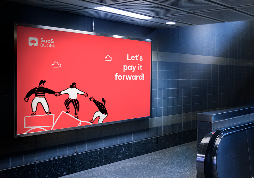
- Pay it forward — The philosophy at the core of the community
- Friendliness — The spirit of helping each other grow
- Uniqueness — The attitude of being a decentralized community in the ecosystem
- The Personification of SaaSBOOMi
Today’s brands are more than just static entities. They have a voice, a heart, and are more personally connected and communicative with their audience as an actual person would. So we set out to figure out who SaaSBOOMi is as a person and what the brand voice should be.
- Informal
- Friendly
- Positive
What is “Pay It Forward”
Like many things in life, paying it forward is easy to say but is pretty hard to be put into practice, and the SaaSBOOMi community does it effortlessly. But how does it do it? What is it about SaaSBOOMi that brings forth this noble ideology in all its members? After carefully studying all its activities, we identified what makes SaaSBOOMi special.

Reliability
SaaSBOOMi can be represented as a family or friend, someone you can rely on any time you need. Whether to share knowledge or help in finding resources, the community is always willing to “Pay-it-forward”.
Support
SaaSBOOMi can be represented as the support system for your business, held together by fellow founders and practitioners.
Knowledge you need
SaaSBOOMi can be represented as a learning ground among equals who are willing to share their knowledge towards achieving a common goal.
Giving back to the community
SaaSBOOMi is all about giving back more than we take. It can be represented as someone who helps nurture the SaaS community together with your fellow founders, share your knowledge, experiences, ideas, and learn together.


A Stronger Logo
To give structure and firmness to the logo, we moved from a circle to a rounded square to represent the intrinsic strength of the community. We established a hierarchy in font weights to enhance legibility. The dimensions of the wordmark are altered to fit into a golden ratio box for visual harmony.
Consistency Through Type
Okta Neue is an extensive typeface built for the web and app realm. The letters are geometric which are easy on the eye & legible in various sizes. The use of a single typeface across all brand touchpoints enhances brand recall and maintains consistency.
The Colors of Inclusivity
What makes a perfect ecosystem is a way it embraces the many, to become one. SaaSBOOMi is the coming together of many for the sake of a common goal. For a brand that stands as a SaaS ecosystem, the diverse colour palette represents the numerous aspects of the community while the primary colours (white and black) represent the unity and inclusivity of the community.
er SaaSBOOMi Playbook, have all added to our portfolio of activities. We have grown together as a brand and hence figured that it’s time our branding reflected that.
Adding more to our excitement, we onboarded an agency, Studio 318, which was tasked with rebranding the SaaSBOOMi community to reflect the global ambitions of the brand and to build a unified, cohesive, and consistent platform towards bringing the community and its various activities, events and initiatives under one roof.
The Essence of SaaSBOOMi
To understand the values that drive the spirit of SaaSBOOMi and the different ways the community symbolizes this concept, Studio 318 facilitated workshops, exercises, and numerous sessions with Avinash Raghava, Suresh Sambandam and myself until we were confident that we had absorbed the essence of what we were trying to recreate. The three main values of SaaSBOOMi that came out of these sessions were:
- Pay it forward — The philosophy at the core of the community
- Friendliness — The spirit of helping each other grow
- Uniqueness — The attitude of being a decentralized community in the ecosystem
The Personification of SaaSBOOMi
Today’s brands are more than just static entities. They have a voice, a heart, and are more personally connected and communicative with their audience as an actual person would. So we set out to figure out who SaaSBOOMi is as a person and what the brand voice should be.
- Informal
- Friendly
- Positive
What is “Pay It Forward”
Like many things in life, paying it forward is easy to say but is pretty hard to be put into practice, and the SaaSBOOMi community does it effortlessly. But how does it do it? What is it about SaaSBOOMi that brings forth this noble ideology in all its members? After carefully studying all its activities, we identified what makes SaaSBOOMi special.
Reliability
SaaSBOOMi can be represented as a family or friend, someone you can rely on any time you need. Whether to share knowledge or help in finding resources, the community is always willing to “Pay-it-forward”.
Support
SaaSBOOMi can be represented as the support system for your business, held together by fellow founders and practitioners.
Knowledge you need
SaaSBOOMi can be represented as a learning ground among equals who are willing to share their knowledge towards achieving a common goal.
Giving back to the community
SaaSBOOMi is all about giving back more than we take. It can be represented as someone who helps nurture the SaaS community together with your fellow founders, share your knowledge, experiences, ideas, and learn together.
A Stronger Logo
To give structure and firmness to the logo, we moved from a circle to a rounded square to represent the intrinsic strength of the community. We established a hierarchy in font weights to enhance legibility. The dimensions of the wordmark are altered to fit into a golden ratio box for visual harmony.
Consistency Through Type
Okta Neue is an extensive typeface built for the web and app realm. The letters are geometric which are easy on the eye & legible in various sizes. The use of a single typeface across all brand touchpoints enhances brand recall and maintains consistency.
The Colors of Inclusivity
What makes a perfect ecosystem is a way it embraces the many, to become one. SaaSBOOMi is the coming together of many for the sake of a common goal. For a brand that stands as a SaaS ecosystem, the diverse colour palette represents the numerous aspects of the community while the primary colours (white and black) represent the unity and inclusivity of the community.
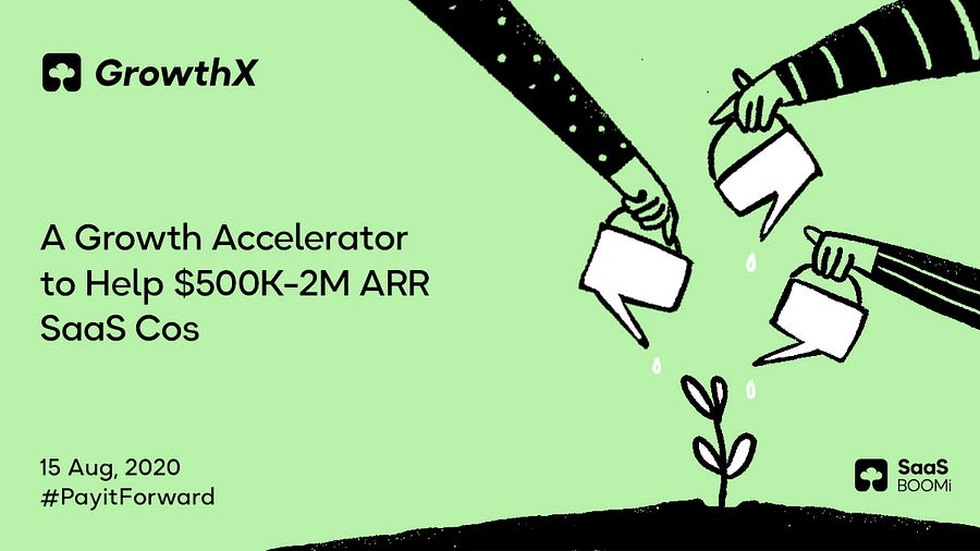
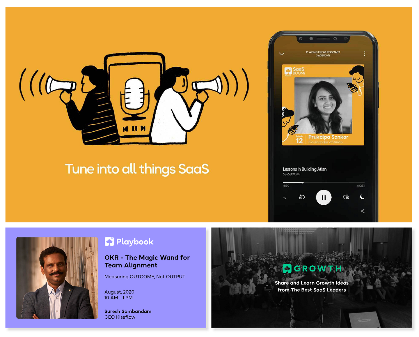
Approachability Through Illustrations
Inspired by the unrefined first-thoughts that translated into global software, the language developed for the illustrations depicts the friendliness of the community. They are hand-drawn, rough, and all-humans with cloud-like heads. The idea behind introducing illustrations for the brand was to make it more approachable and fun.
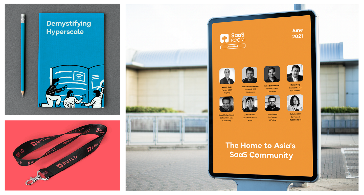
Holistic, Thoughtful Design
Extending the brand identity to all the verticals, we designed a system that is infused with colours, illustrations, and elements in an attempt to bring new energy and positivity to the brand.

To A New Beginning!
The SaaSBOOMi community is no less than a family. It is an inclusive community where dialogue, ideas and support are strongly encouraged. It is a place where every SaaS founder can feel welcomed and safe. So at every stage of the design process, we tried to capture and reflect the spirit of the community. This wouldn’t have been possible without Avinash Raghava and Suresh Sambandam for always being available to answer our endless questions, as we dug deep into the core of the brand.
Rebranding is not a walk in the park. It is rather a marathon which needs heavy design thinking, logical reasoning and visual rationales that connect to human emotion. When we were starting this project, we had the option of going with the best design agencies possible but we went ahead with Studio 318, a team of 8 passionate designers trying to do something different. We felt that they had great potential and could deliver the best. We weren’t wrong! The Average age of our design & development team is 24, and these dreamers put-in their heart and soul in this process for creating something unique. We’re excited to see the growth of SaaSBOOMi and are glad to be a part of the journey. Let’s pay it forward!
Special thanks to Avinash Raghava, SreeVishnu Mallela, Sadhana Balaji and Varun for helping me put together this blog.